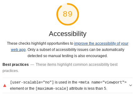
Today, we will cover an often overlooked, but extremely important aspect of web performance: accessibility. Over 4 million people use screen readers when accessing websites in the United States, and simple modifications to your website make a big difference on their experience. This article obviously cannot be a full review of website accessibility, but instead will focus on the most prominent improvements: alt-text for images and color contrast. After these improvements, our webpage’s accessibility score went from 73 to 89 - which is 16 points higher for only an hour of light work! Depending on the configuration of your website, it may take a bit longer, but ideally these steps will become part of the deployment process for your website. Developers should be in the habit of setting alt-text for images and using the same high-contrast font colors.
Getting Started
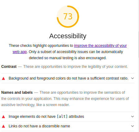
To get started, we’re going to kick off a Lighthouse audit in the developer tools of our web browser. This will provide us with a list of the accessibility improvements that can be automatically audited. As noted in the audit, it is recommended that you manually check additional items on your website that cannot be automatically audited. We’ll cover that in a future post, but for now we’re going to focus on the automatically generated recommendations. As always, if you are not comfortable using your browser’s developer tools yet (or perhaps you are reading this from a mobile device), you can enter the URL you would like to audit at the Google PageSpeed Insights website to generate an online copy of the audit. For a recent blog post, the audit currently looks like this:

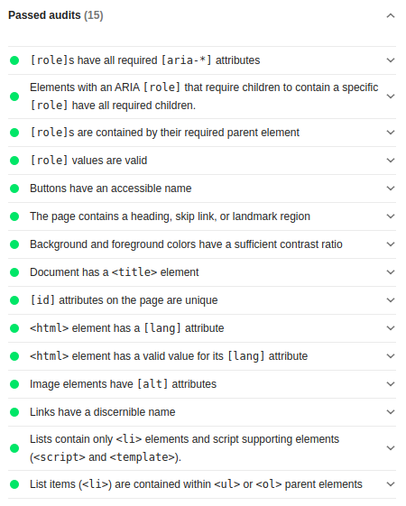
A score of 73 is not ideal. Fortunately, there are some recommendations right within the Lighthouse tool to improve this score. Several passed audits are also noted under the Passed Audits tab, so your recommendations may be different than those shown here. With this information, we can move on to start actually implementing these improvements!
Accessibility Improvements
As I mentioned before, we’ll be focusing on updating the text colors to be have a sufficient contrast ratio, and ensuring the alt-text is set for all of our images.
High Contrast Colors
First up, we’ll inspect each element that the Lighthouse audit identified with too low of a contrast ratio. If you need help choosing a high-contrast color that will mesh with your color scheme, you can check out the W3 Library on High-Contrast Colors for Links or the Google Developer’s Page on Color Contrast.
For the strangePy website, most of the element colors can be updated by changing the .post-meta section and the a section of our main.css file. There are also a few edits that need to be made to the navigation links in the footer as well as minor updates to the theme-by and copyright-by classes.
Post-Meta Class
.post-preview .post-meta,
.post-heading .post-meta {
  color: #666666;
  font-size: 18px;
  font-style: italic;
  margin: 0 0 10px;
}
Navigation Links
For the a tags, when we open the main.css file, we see this:
a {
  color: #0066CC;
}
a:hover,
a:focus {
  color: #0085A1;
}
That does not look like normal CSS. Instead, we’re using custom Liquid variables to create a simple color scheme. Instead of setting this directly in main.css, we’ll need to head over to the config.yml file to update these. As you can see below, many of the navigation link (anchor tag) colors are controlled by this config.yml file. This means that there is one convenient place to update the link colors and we do not have to dig around in the CSS for popular settings. For today, we only need to update the link-col and the footer-text-col parameters.
Before
# Personalize the colors in your website. Colour values can be any valid CSS colour

navbar-col: "#F5F5F5"
navbar-text-col: "#404040"
navbar-children-col: "#F5F5F5"
page-col: "#FFFFFF"
link-col: "#008AFF"
hover-col: "#0085A1"
footer-col: "#F5F5F5"
footer-text-col: "#777777"
footer-link-col: "#404040"
After
# Personalize the colors in your website. Colour values can be any valid CSS colour

navbar-col: "#F5F5F5"
navbar-text-col: "#404040"
navbar-children-col: "#F5F5F5"
page-col: "#FFFFFF"
link-col: "#0066CC"
hover-col: "#0085A1"
footer-col: "#F5F5F5"
footer-text-col: "#666666"
footer-link-col: "#404040"
That’s all the links for this website! You may have more or fewer CSS edits to make than shown here, but the process to edit them should be quick. Plus, these edits should only be necessary once, and all future HTML elements will pull from these same color schemes.
Alt-Text for Images
This part is much simpler. For each image of your site, you simply need to set the alt parameter of the image. This should only take a few minutes and ideally will be become part of your routine.
Analyzing the Results
One of the benefits of using the Lighthouse tool to audit your site is how quickly another audit can be run in your browser! GitHub pushes out changes to static websites like this one very quickly so within a few minutes we can see the result of these improvements.

Excellent! Our accessibility score has improved from 73 to 89 with just a few minutes of work! To verify these updates went through, we can also expand the “Passed Audits” section and see both of these items marked in green now.

This is where we will stop for today, but there will be future articles about improving accessibility on your website!